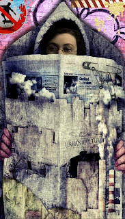
Vron across at Artarazzi Challenge blog gave us a John Waterhouse picture this week. Along with the picture she asked us to use a dash of orange.
This is my interpretation. (It does rain a lot here in the UK.)
I used the John Waterhouse picture which I altered, the orange flower and the background (much altered) are from the lovely designers at the WaterLO Project, and the rain drops are courtesy of Kubivet.
Thank you for looking.
Saturday, 31 January 2009
Thursday, 29 January 2009
Theme Thursday - Alice Gets Smaller
Wednesday, 28 January 2009
Mixed Media Monday - Britain
This week MMM asked for a picture that best represented where we each came from.
The Union Jack came to mind first and then of course Daffodils followed closely by Lewis Carroll's Alice In Wonderland. So here we are.
The field of Daffs is one of my own photos, Tartx provided the Alice pngs, and the flag was Googled.
Thank you for looking.
The Union Jack came to mind first and then of course Daffodils followed closely by Lewis Carroll's Alice In Wonderland. So here we are.
The field of Daffs is one of my own photos, Tartx provided the Alice pngs, and the flag was Googled.
Thank you for looking.
Monday, 26 January 2009
Sunday Postcard Art - Cats
Sunday, 25 January 2009
Collage Play with Crowabout - Where Your Creative Soul Begins
This is my second entry for a Collage Play With Crowabout challenge, and I love doing them.
All the elements for this collage were courtesy of Nancy Baumiller aka Crowabout who provided them for Challenge 21.
The font used is Arno Pro.
Thank you for looking.
{in a small whisper with a big cheesy grin} I won the challenge last week and await my goodies in the post. Yaay.
All the elements for this collage were courtesy of Nancy Baumiller aka Crowabout who provided them for Challenge 21.
The font used is Arno Pro.
Thank you for looking.
{in a small whisper with a big cheesy grin} I won the challenge last week and await my goodies in the post. Yaay.
Saturday, 24 January 2009
Simply Skinnies - Fashion
This is my entry for this week's Simply Skinnies challenge and the theme is fashion.
I think it's safe to say this particular lady likes her hats.
I used a background image by Happy Scrap which I duplicated and blended.
The lady is courtesy of the very generous Takeabreak (public domain) at Flickr. I duplicated her also, used a hard light blend and finally used a poster filter to get this look.
The font is Arno Pro.
Thank you for looking
Friday, 23 January 2009
Make A Moo Or Two - Buildings
The guest host at Make a Moo or Two this week chose buildings as the theme.
Alice looks quite cosy in here don't you think?
Credit to Donna Miller for the backgrounds and the book, Happy Scrap for the bird, Irene Alexeeva for the paper curl, and Grandma's Graphics for the copyright free Sir John Tenniel illustration.
Font is Arno Pro.
Alice looks quite cosy in here don't you think?
Credit to Donna Miller for the backgrounds and the book, Happy Scrap for the bird, Irene Alexeeva for the paper curl, and Grandma's Graphics for the copyright free Sir John Tenniel illustration.
Font is Arno Pro.
Thursday, 22 January 2009
Stock Photo 59 - Digital Art Quirks
Helen hosted the stock photo challenge this week at Digital Art Quirks and chose the three chairs below.
They were part of a larger image so I used the magnetic tool to draw round them and cut away as much of the background as I could, and the eraser tool to carefully erase between the arms. The image in its raw state was very small so I duplicated three times to get some depth of colour to enable me to bring it up to a usable size.
After that it was relatively plain sailing as Gouzi-Akiloune's Street Spirit kit provided the rest.
The stock photo was courtesy of Stockxchnge by Sundstrom.
Thank you for looking.
Monday, 19 January 2009
Artarazzi - Challenge 6
The challenge was hosted this week by Bev who chose a very interesting stock photo from Stockxchange.
I like stock photos as they always inspire me and this is mine for this week's challenge.
Credit to Tangie Baxter for the 1920s lady, Aprilmouse for the background and to sxchange 1131992 for the amazing stock photo.
Thank you for looking.
I like stock photos as they always inspire me and this is mine for this week's challenge.
Credit to Tangie Baxter for the 1920s lady, Aprilmouse for the background and to sxchange 1131992 for the amazing stock photo.
Thank you for looking.
Mabel Knows How to Party
It was my turn to host the Quirkle challenge this week.
I asked those entering the challenge to use :
1 A stripey leg (or two)
2 A crown
3 Something red.
Here's what I came up with. That wicked Mabel strikes again.
Credit goes to Franco Folini and Oracio Alvardo for the house and legs. The background is Booland Designs and the rest, excluding Mabel, is from the wonderfully talented and generous Irene Alexeeva.
Thank you for looking.
Sunday, 18 January 2009
Collage Play with Crowabout - Wake My Muse
I'm a member of the Flickr website and I've found the most wonderful challenge on there called Collage Play with Crowabout.
Each week she supplies a collage sheet and the challenge is to use 3 or more pieces from the sheet to create some kind of collage.
This is my very first attempt and I'm sure it will open up lots more creative possibilities for me.
So credit to Nancy Baumiller aka Crowabout for all the collage elements, except for the lime background which is my own and the fonts used : Budmo Jiggler, Baron Kuffner, Futura and Tom's Handwriting.
Thank you for looking.
Friday, 16 January 2009
Make A Moo Or Two - Circles
Art Creation Friday - School Days
Simply Skinnies - Hollywood
Thursday, 15 January 2009
Theme Thursday - Couples
Wednesday, 14 January 2009
Monday, 12 January 2009
Artarazzi Challenge
This week at Artarazzi Vron asked us to use the photo of the three ladies by Barbara Moustafa at Deviant Arts as the base for our work, and this is what came to mind for me.
Madam Mim provided the background and the curtains and audience are from Sailor and Lula (everything altered).
Thanks for looking.
Madam Mim provided the background and the curtains and audience are from Sailor and Lula (everything altered).
Thanks for looking.
Sunday, 11 January 2009
Gothic Arch - Grunge
Sunday Postcard Art - Winter Mystical
Saturday, 10 January 2009
A Moo Or Two - Winter Frost
The theme this week is Winter Frost, though making sure it didn't take a backward step into a Christmas scene was quite difficult.
Here in the UK we've been in the grip of a fierce deep freeze since Christmas Eve and this little Moo just says freezing weather to me and I hope it does for you.
Credit to the wonderful designers of the WaterLO Project.
Here in the UK we've been in the grip of a fierce deep freeze since Christmas Eve and this little Moo just says freezing weather to me and I hope it does for you.
Credit to the wonderful designers of the WaterLO Project.
Thursday, 8 January 2009
Theme Thursday - Vintage Love
Sometimes your muse takes you places you never thought to go and this is one of those times. Albert came to mind and as soon as he did it occurred to me that his love might always be divided. So here it is.
Albert and Mrs Einstein were Googled and to some extent altered, and I made the hearts.
Font used : Papyrus
Albert and Mrs Einstein were Googled and to some extent altered, and I made the hearts.
Font used : Papyrus
Tuesday, 6 January 2009
Artarazzi - Challenge 4
Monday, 5 January 2009
Mixed Media Monday - Moon
Maria is the guest host at Mixed Media Monday this week and she's chosen Moon as the theme and that made me think of this nursery rhyme.
The cow is courtesy of Kendrive, the moon is from Paper Relics, other bits were Googled and altered.
I created the background using Vanilla Sky brushes and overlayed with a filter.
Font is Prissy Frat Boy.
The cow is courtesy of Kendrive, the moon is from Paper Relics, other bits were Googled and altered.
I created the background using Vanilla Sky brushes and overlayed with a filter.
Font is Prissy Frat Boy.
Sunday, 4 January 2009
Sunday Postcard Art - Celebrate
Saturday, 3 January 2009
Scary Fairy Tales
Scary fairy tales is the theme at Art on the Darkside this week and this is my contribution.
The background photo is one of my own and the wolf and Red were Googled.
I treated the whole thing to a number of layers and blendings to get the desired effect and finished with a Fresco filter to sharpen up the highlights.
The background photo is one of my own and the wolf and Red were Googled.
I treated the whole thing to a number of layers and blendings to get the desired effect and finished with a Fresco filter to sharpen up the highlights.