Friday, 27 February 2009

Digital Art Quirks - Stock Photo Challenge

Laurel hosted the stock photo challenge this week at Digital Art Quirks and this is what I did with it. It's called, not surprisingly, Eye Eye.

Credit to L Avi at Stockxchnge for the stock photo and to Artsy Fartsy Queen at Flickr for her (free to use) Eyes Collage sheet.

Thank you for looking.

Thursday, 26 February 2009

Theme Thursday - Beach - Nautical Theme

A nautical theme is the order of the day at Theme Thursday this week.

Credit must go to Takeabreak for this wonderful image of the three bathers and to Sailor and Lula for the beach elements.

Thank you for looking.

Wednesday, 25 February 2009

Collage Play with Crowabout - Love at First Sight

Week 25 of the Collage Play with Crowabout challenge.

All elements of my collage are courtesy of Nancy Baumiller aka Crowabout.

Font : Persimmon

Thank you for looking.

Tuesday, 24 February 2009

Digital Art Quirks - Technique Challenge No 2

There's a new techniques challenge at DAQ hosted by Donna where this week we learned how to create a line drawing from an image of our choice.

www.digitalartquirks.com

Thank you for looking.

Monday, 23 February 2009

Sunday Postcard Art - Mardi Gras

My entry for the Sunday Postcard Art challenge.

The very skinny ladies (much altered) are courtesy of MJ Tripsa (free to use image at CC Flickr), Madam Mim for the background, Kubivet for the window and 51291 for the wonderful range of masks.

Thank you for looking.

Sunday, 22 February 2009

Gothic Arch - Tea Time

Tea time is the theme this week for the Gothic Arch challenge, and as the Mad Hatter had a very famous tea party I thought you might like to see it.

The backgrounds (both inside and outside of the arch) are courtesy of Irene Alexeeva and the stamp is by SherrieJD and Tangie Baxter.

Thank you for looking.

Saturday, 21 February 2009

Daily Art Stop - Paris

Created for the Daily Art Stop Wednesday challenge of Paris.

Background courtesy of Ginger Scraps. All other elements are by Rachness.

Thank you for looking.

Thank God It's Friday - Hands

Hands is the theme at TGIF this week.

I used a handprint brush as a template and added the background and the script both courtesy of Takeabreak (free to use) at Flickr.

Font : Slugfest

Thank you for looking.

Three Ages of Woman by Gustav Klimt

This is my all time most favourite painting ..... ever. I made a fridge magnet so I can look at it every day.

The Three Ages of Woman by Gustav Klimt is courtesy of Freeparking who provided (a free to use image on CC Flickr). Credit also to Kubivet for the window frame and the flowers.

Click to enlarge if you want to see the detail.

Thank you for looking.

Tuesday, 17 February 2009

Fidget's Freaky Friday Collage Challenge


A new collage challenge on Flickr and this is the first week.

Credit for everything other than the tree to Fidgetrainbowtree's free to use images at Flickr.

Thank you for looking.

Monday, 16 February 2009

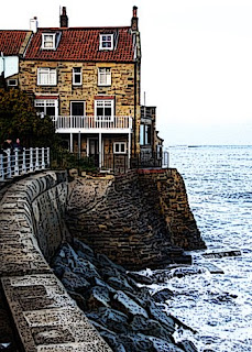
Think Monday Think ATC - Roofs of Our World

Roofs of our world is the theme this week at Think Monday Think ATC.

I duplicated layers, added a hard light blend, and added a poster edge filter.

Photograph is my own and is a view of a house at the very dramatic village of Robin Hood's Bay, North Yorkshire.

Thank you for looking.

Quirkle 76 - Gypsy


Kimmie is the host for the Quirkle at Digital Art Quirks this week and she has chosen the theme of Gypsy. She asked us to use :

1 Beads
2 A flower
3 Something pink.

Here's mine.

Credit to Deejay Marlon for the image of the girl (CC at Flickr), Eifie's Designs for the curtain and window, Sweet Blossom's Design for the background, Aprilmouse for the flower and beads, and Shawn Headley for the diamond rain.

Thank you for looking.

Sunday, 15 February 2009

Collage Play with Crowabout - I Want You For My Valentine

For Nancy Baumiller's Collage Play With Crowabout on Flickr.

All elements are from Nancy's collage sheet.

Speech bubble shape from PS.

Font : Junk Culture.

Thank you for looking

Sunday Postcard Art - Hearts

Hearts is the theme at Sunday Postcard Art this week, and Mabel wanted to get involved, so she's sending a belated Happy Valentine greeting to you all.

Credit to Little Dragon, Design by Sassy, Designs by Helly, Scrapkitten and Just2morethings.blogspot for the background and elements.

Thank you for looking.

Saturday, 14 February 2009

Artarazzi - Me, Myself and Eye

Me, myself and I is the theme at Artarazzi this week. Vron asked us to create something that included a photograph of our self.

This is me blinking into the camera and the sun aged about 3. I have lots of photos of me doing this same thing.

In case you're wondering what the journaling says, it's a little rhyme my Grandma used to say to me around about this time :

There was a little girl, who had a little curl
Right in the middle of her forehead
When she was good she was very very good
But when she was bad she was horrid.

Mmmmm.

Credit to Happy Scrap for the background. The card was Googled.

Fonts : Journaling hand, Ransom and Sketch Rockwell.

Thank you for looking.

Friday, 13 February 2009

Make a Moo Or Two - Marie Antoinette


Marie Antoinette is the theme at Make a Moo Or Two this week.

Credit to Takeabreak for the lady.

The font is : Guild of Professional Actors.

Thanks for looking.

Art on the Dark Side - Carousel

I once got on a carousel horse with my grand daughter, but had to swap places with hubby as I just couldn't do it!!! Aaaagh.

Credit to Takeabreak for the ladies and to Michael in Flagstaff for the carousel horse (both in the public domain).

Thank you for looking.

Thursday, 12 February 2009

Frameworthy - Gloria

The task at for the Frameworthy Challenge at Scrapbook Graphics this week was essentially to create a picture that resembled fabric. I'm not sure I've achieved that but I did enjoy doing it.

Credit to SilentLadiesandGents.com for Gloria and the background is courtesy of the WaterLO Project designers (both of which were layered, blended and filtered).

Thank you for looking.

Digital Art Quirks Stock Photo Challenge - Diving


Bev is the host for the stock photo challenge this week and she chose an image that looked like blood in water by Lucretious at Stockxchnge. I layered this and blended it to give it a rich orange colour.

I then used a torn paper image by Booland Designs, some paper curls by Irene Alexeeva and and l blended these with a script background by Takeabreak at Flickr. Finally, I added a couple of divers, also by Takeabreak and used them to give the impression of diving into the stock photo impression of fluid.

Thanks for looking.

Wednesday, 11 February 2009

Collage Play with Crowabout - Play

It's week 23 of Nancy Baumiller's Collage Play with Crowabout.

Here is my interpretation.

All elements are courtesy of Nancy Baumiller who provided the collage sheet.

Fonts used are FG Tina, FG Adam, Eight Track Program 3, and Doodolonomy Fred.

Thank you for looking.

Monday, 9 February 2009

Think Monday Think ATC - Mail

My contribution for the TMTA challenge this week.

The children, looking none too happy, are courtesy of the very generous Playing With Brushes from Flickr (in the public domain).

The postcards and letters are from my own collection.

Thank you for looking.

Sunday, 8 February 2009

Quirkle 75 - Grunge

Lumilyon hosted the Quirkle again this week and gave us the lyrics of a song and the challenge was to illustrate 3 of the lines.

I chose 9 Bright Shiners, 6 Proud Walkers and One (is one and all alone).

See the lyrics here

Credit to Takeabreak for the girl, David Boyle for the Old People sign, Mike Baird for the Walkers and Vizzzual.com for the traffic lights.

I also used brushes by Neveryph 1 to get the grunge background and by 500ml for the People Walking sign. Mabel is also in there somewhere and she is one of the family and her photo belongs to me.

Thank you for looking

Friday, 6 February 2009

Artarazzi - Challenge 9

I am the guest host at Artarazzi this week for Challenge 9 and I chose an illustration from the Art of Costume Design, a vintage magazine courtesy of Takeabreak at Flickr.

I gave my elegant lady some definition, added a brackground, gloves, fan, crown and flowers all courtesy of Irene Alexeeva, and put her in the spotlight courtesy of Fiddlette Designs theatrical curtains.

Thank you for looking.

Thursday, 5 February 2009

Theme Thursday - Borders

Sometimes I don't know where it comes from but it definitely wants to get out! So here's my entry for the theme of borders at Theme Thursday.

The background, the borders and the sign were all done with brushes by 500ml and Neveryph 1.

The women are courtesy of Takeabreak at Flickr, other bits are magazine clippings.

Thank you for looking.

Collage Play with Crowabout - Food

For Challenge 22 of Nancy Baumiller's collage challenge.

All elements other than the two custom shapes (arrows) were courtesy of Nancy (Crowabout).

Fonts used were Artistamp, Brush Script, Chalkboard and Agent Red.

Thanks for looking.

Sunday, 1 February 2009

Gothic Arch - Tag

The theme this week was to incorporate a tag into the arch.

I used Irene Alexeeva backgrounds and elements to create this.

Thank you for looking

Stock Photo 60 - DAQ

It was Nevermore's turn to host the stock photo challenge at Quirks this week and she chose a pair of eyes by Neil-S at Stockxchnge.com.

I thought the eyes needed to be peeping out of somewhere, a door or letter box and so this idea came to me. She was guiltily peeping from the Post box after creating so much graffiti. Again I used Gouzinette and Akiloune's Street Spirit kit for the background. The Post box is from a photo.

Thank you for looking.

Quirkle 74 - Digital Art Quirks

It was Lumilyon's turn to host the Quirk challenge this week at Digital Art Quirks where she asked us to try Reverse Graffiti. The idea is to make art by cleaning areas of dirty wall by using stencils and acid to create images. As we were required to do this digitally it remained a very safe process!

I used Street Spirit kit by Gouzinette and Akiloune, and two custom shapes in Photoshop.

To achieve reverse graffiti I desaturated where necessary, inverted to get white and chose overlay or hard mix blends and reduced visibility to create a see through effect.

Thank you for looking.